When 1m people read your newsletter, you learn what works and what doesn’t. During my time at The Hustle, I was involved in several newsletter redesigns. After countless iterations and experiments, we’d often return to the same design principles.
Why?
Because they work.
And why fix what isn’t broken? Or at least, that’s the lesson we learned. This post distills those design principles into a framework any team can use to design their newsletter product.
First, let’s focus on general settings.
The set up:
Regardless of the email service or software you use, these settings should be available to you. They are settings that affect the body of the email. Set them to:
- 600px body width*
- NO background color
- Black 16px font, Sans-Serif Arial. Don’t get fancy
- One column.
That’s it. Remember: simple is better, because simple is legible. And these settings pull double duty. The 600px width looks good on most screen sizes without much fiddling.
For heading sizes, I typically like the following:
- H1 : 22px
- H2 : 20px
- H3 : 18 or 17px
I recommend using H1 or H2 for article titles and H3 for subtitles. You can play around with weights and line-heights. It helps to make the line heights of subtitles (H3) slightly higher than that of paragraphs. It helps break up the text and your articles — makes it easier to skim.
(*If you are using Mailchimp, 600px will be the default width. No need to change this setting.)
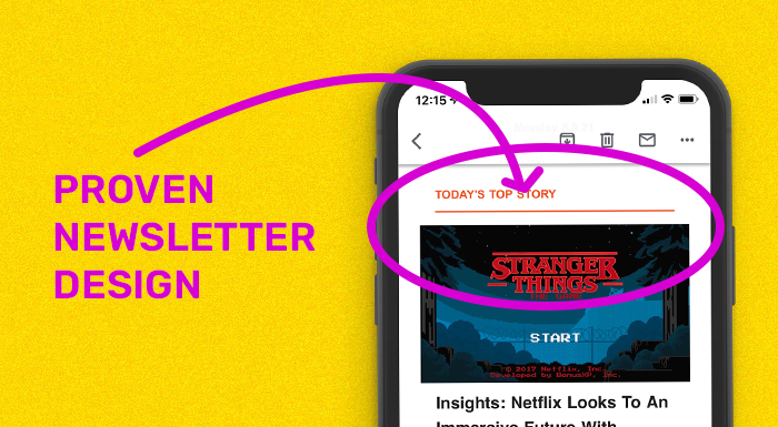
The #1 newsletter design priority – “Make it skimmable”
Some readers will read top to bottom, but you want to optimize your design for scanners and skimmers.
Most of the advice in this article fosters that. Skimmable, legible, and approachable. Nobody wants to hit a large block of text at the start of an email. That said, I know massively successful newsletters with pretty awful design. So, take my advice with some salt.
Remember to incorporate hierarchies in text, break up large paragraphs, and use images/graphs to anchor attention.
If you do this well, readers will engage with your content for longer periods of time and have a more positive experience.
Now, let’s talk newsletter parts ?
The parts of your newslettter
1. Header – Top of the email
Needs:
✅ Logo of your Newsletter
✅ Logo of advertiser
✅ Personal intro from Editor
The personal intro is HUGE. It came late for The Hustle.
Its purpose is to build audience engagement. It’s one of the rare instances your editors can speak directly to readers. It does not have to be a summary of the newsletter or a table of contents. Those can work, but don’t feel obligated to do that every time.
It’s about building trust and loyalty. Not being a band or robots behind an email. Plus, this can be an absolute ace at driving clicks (if needed).
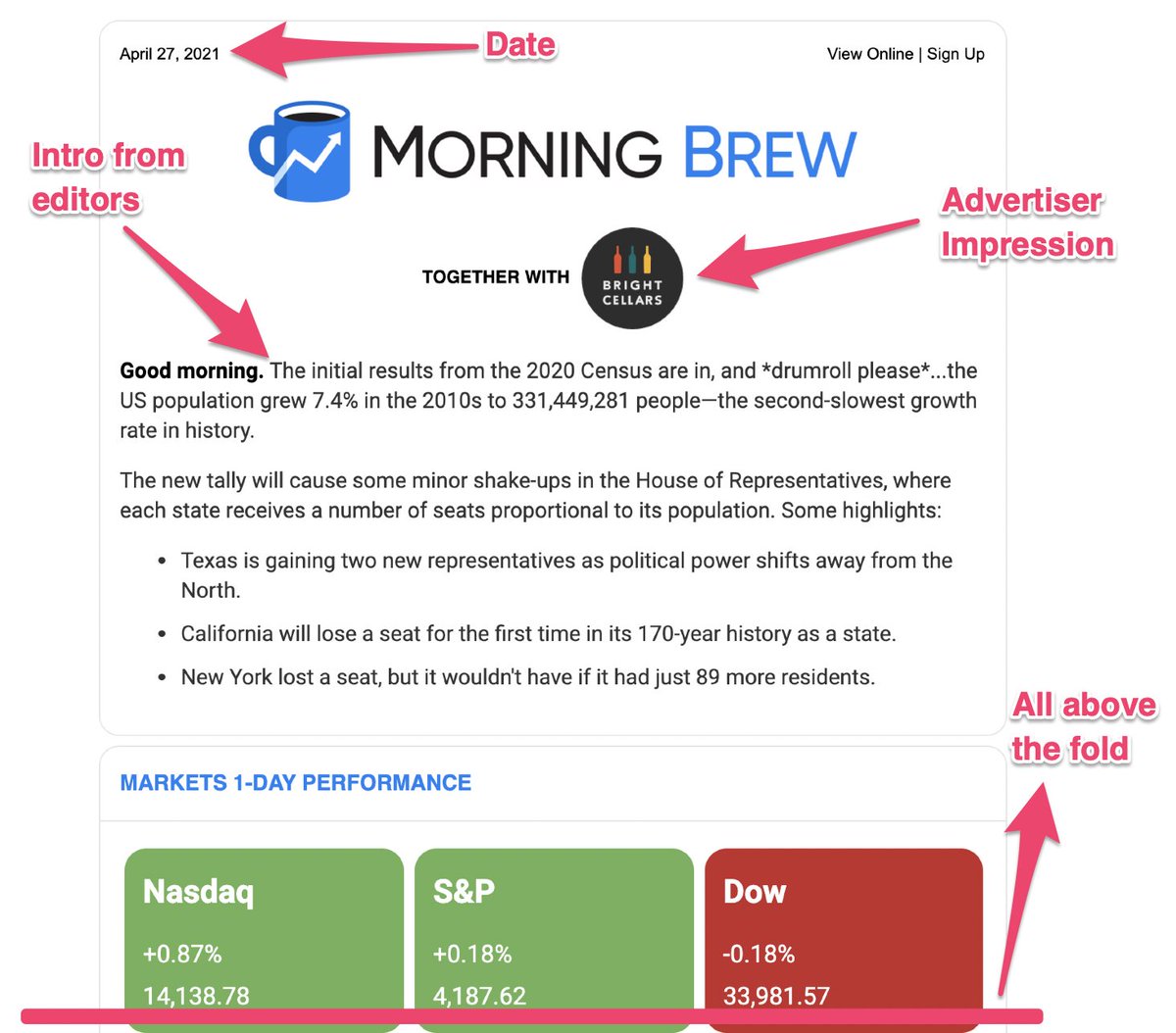
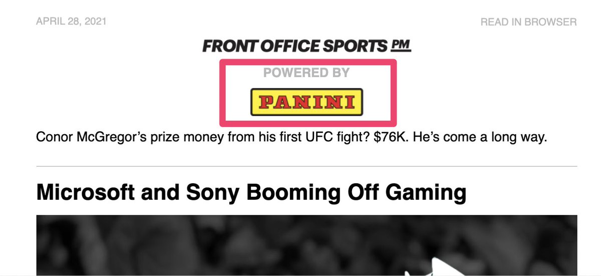
TACTIC – Advertiser logo above “the fold.”
Newsletters that monetize through advertisement will often place the advertiser’s logo just below their own — above any other content. (See pictured below.)
Why? It’s all about impressions.
Doing this guarantees an impression for the advertiser. Top of the email, can’t miss it, every open sees logo. Savvy marketers know ads placed below content get skipped. This helps overcome certain objections when selling ads.
“Hey, they’ll all see your logo.”
2. The Brief – The content of your newsletter.
Remember what I said earlier — it’s all about skimmin’ ?♂️
Needs:
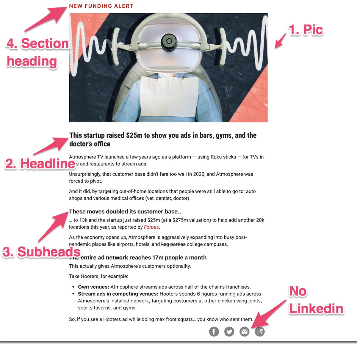
- Section Heading – (next tweet details)
- Eye-catching graphic
- Headline
- Subheads
- <4 lines of text in a paragraph
Folks have asked about including share buttons. In my experience, share buttons are rarely used. Plus, ask yourself what action you want an enthusiastic reader to take? Share a hosted article link on Twitter?
Or, forward the email to 6 peers?
Remember: Eyes scan from pic to headlines. Use that when designing AND when creating content.
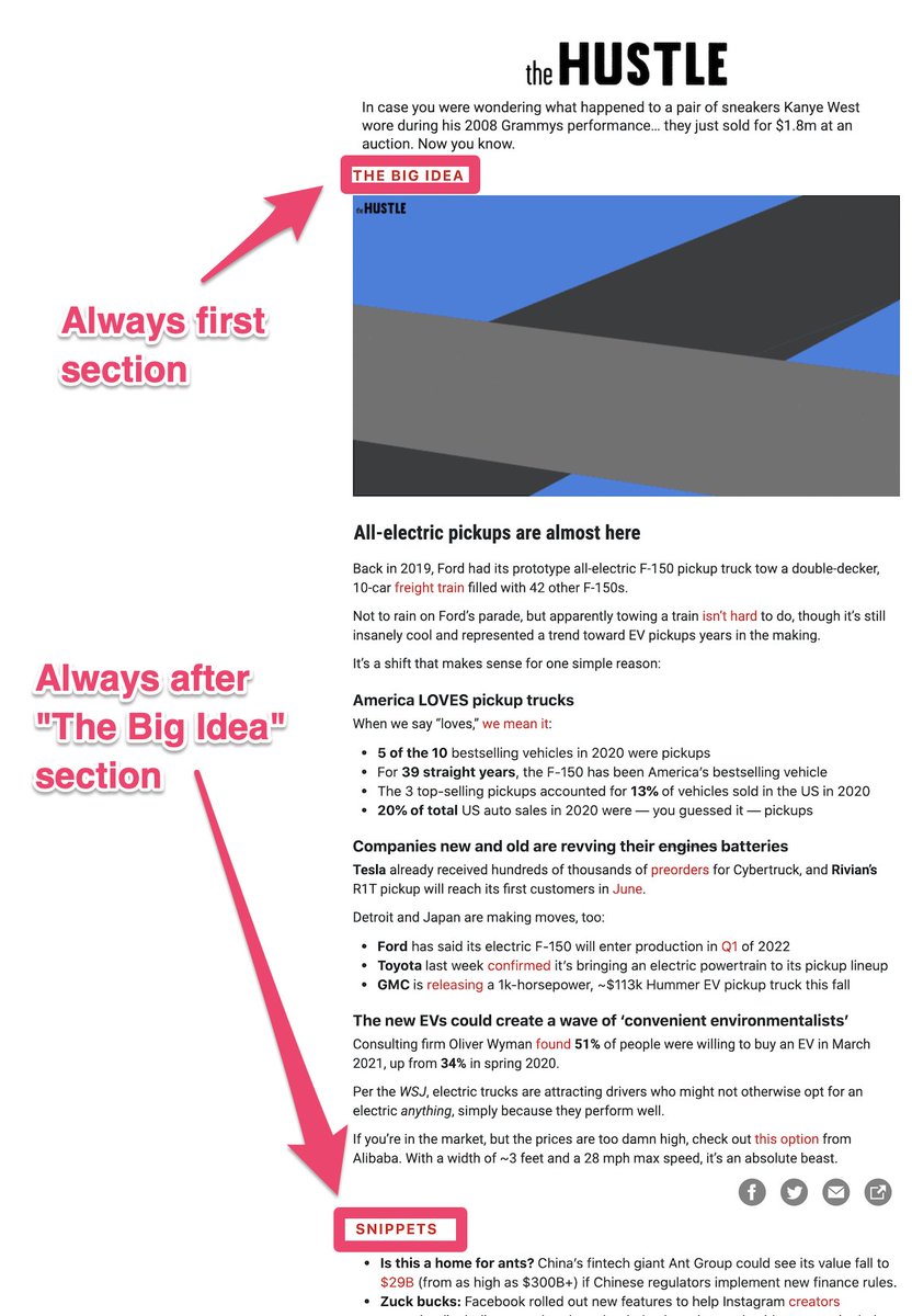
3. Section headings for navigation
These are general headings related to content within newsletter sections. They help users navigate and create consistency between your sends. Certain sections go after others, run on specific days, etc.
Consistency creates habits. Habits lead to high engagement. That is $$$ in newsletter circles.
They also facilitate placing sponsored sections.
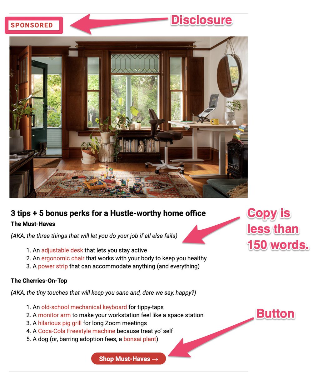
4. Advertisements
The advertisement in any newsletter is a meaty topic. Often, it’s the only piece of content, you (the newsletter operator) are not 100% in control of. You have an advertiser to get approvals and edits from.
Whether selling sponsorship or promoting a paid sub, here’s some tips:
- Buttons are nice-to-haves
- Use pics IF your briefs have them
- Follow the same format as your briefs
- Single CTA
- 150 words or less
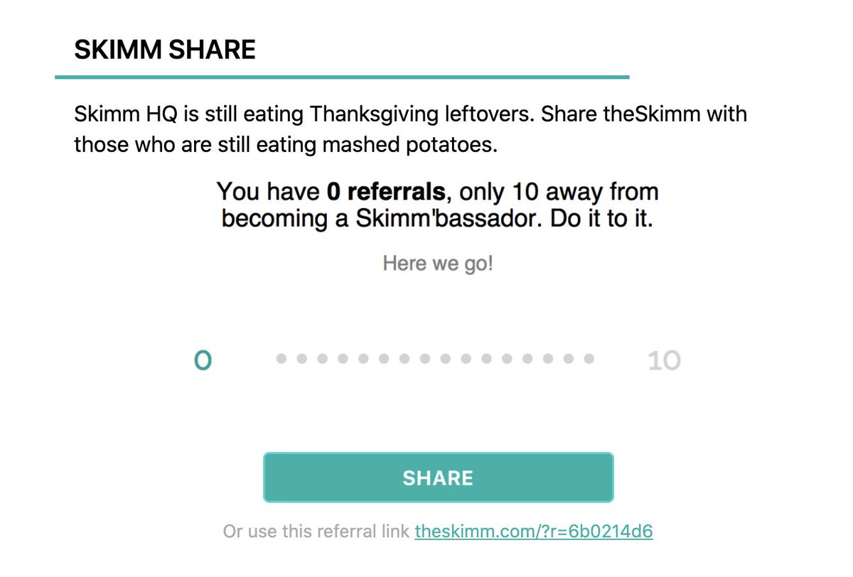
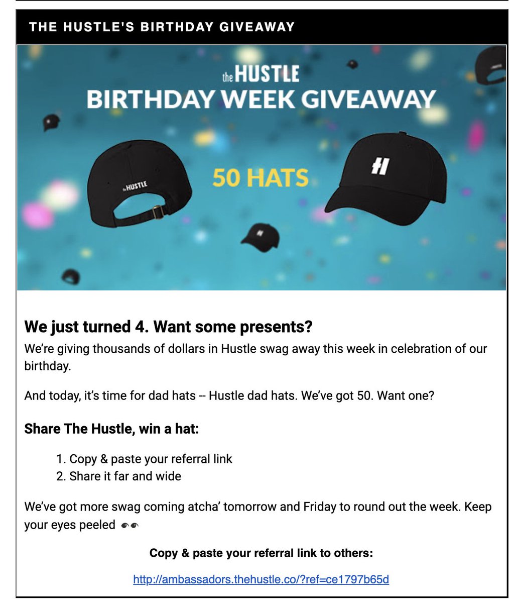
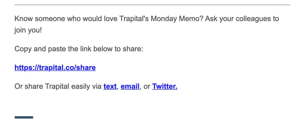
5. A dedicated Referral Section
This is a section of content devoted to subscriber growth. Often, they take the form of referral prizes (stickers, hats) and can feature sophisticated tracking for users.
Larger newsletters have well-developed prizes and tracking for their referral programs, BUT smaller publishers shouldn’t sleep on this.
Just ASK your readers to share.
Make ’em feel special.
Examples: @TrapitalMedia @TheHustle @theskimm
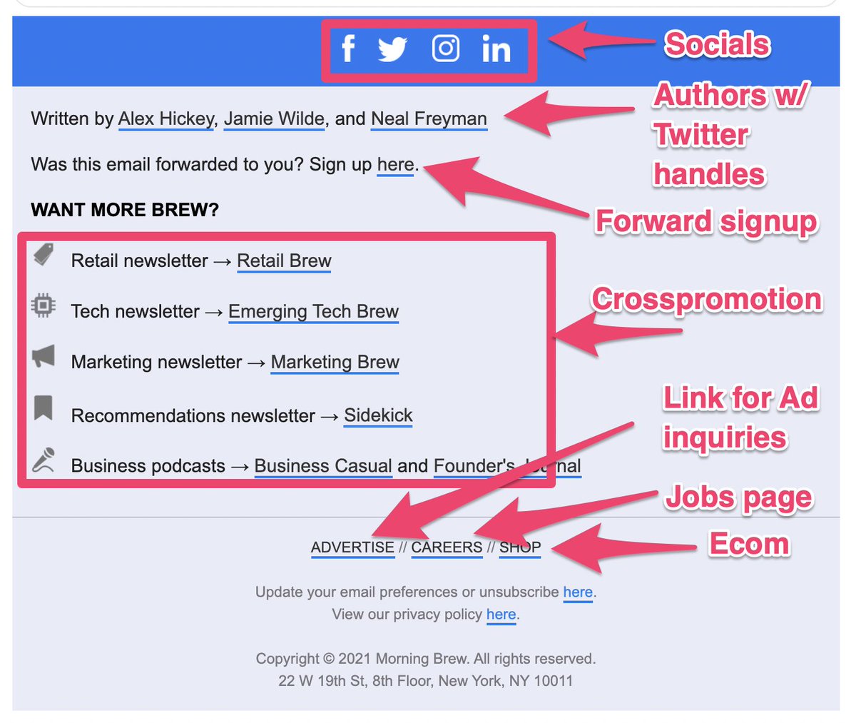
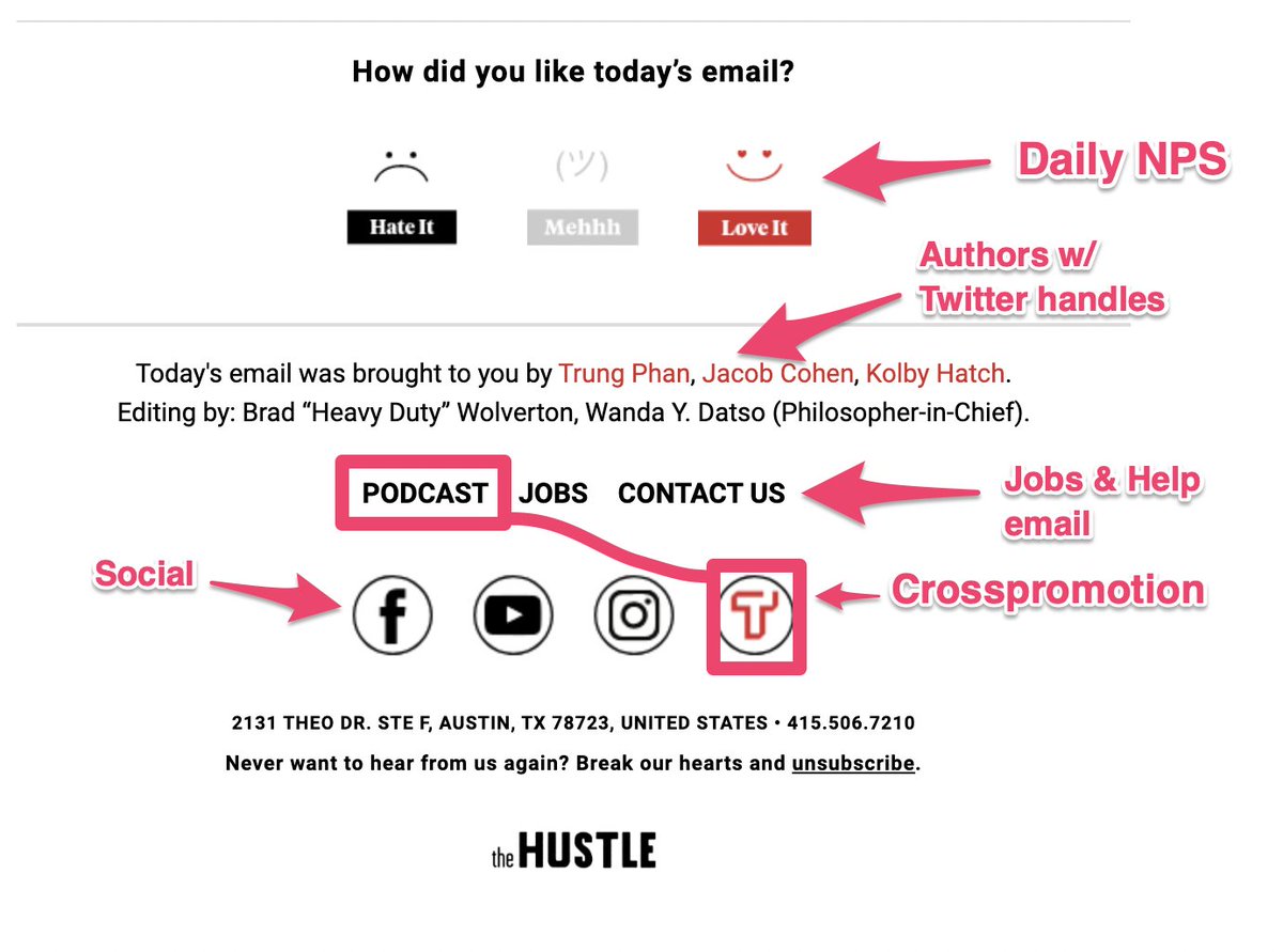
6. The Footer
This is the bottom of the email, and is often forgotten. BUT there is a lot you can do.
These get low volume clicks, but they’re HIGH value and engagement. Who clicks the bottom of your email? You #1 fans, that’s who.
Morning Brew has always done a good job using this space.
Compare that to The Hustle with their daily NPS survey.
7. Know the laws
Look up the CAN-SPAM law but most ESPs will automatically provide the baseline requirements like Address, Unsub link, in their templates.
Bigger issue is spam traps, or just making it to the inbox. That’s another article.
The law: https://www.ftc.gov/tips-advice/business-center/guidance/can-spam-act-compliance-guide-business
TLDR – 7 newsletter principles
- Header with logos
- Briefs should have visual hierarchy
- Use navigational headlines
- Ads should follow brief format (shorter)
- Dedicated section asking readers to share!
- Use your footer. Fill it with links.
- Don’t be SPAM
Think I missed something? Comment and let me know.