Q: Why does every newsletter signup page look the same?
A: Because it just works.
Here’s the full breakdown of The ULTIMATE newsletter landing page
"WTF are we talking about?"
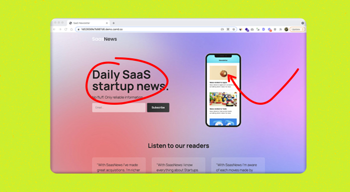
I shared this page a few weeks back.
It's my take on the ultimate, generic newsletter landing page. It's designed for signups and only signups.
The Hustle grew to 1.5M subscribers with a page like this. EVERY subscriber went to this page FIRST.
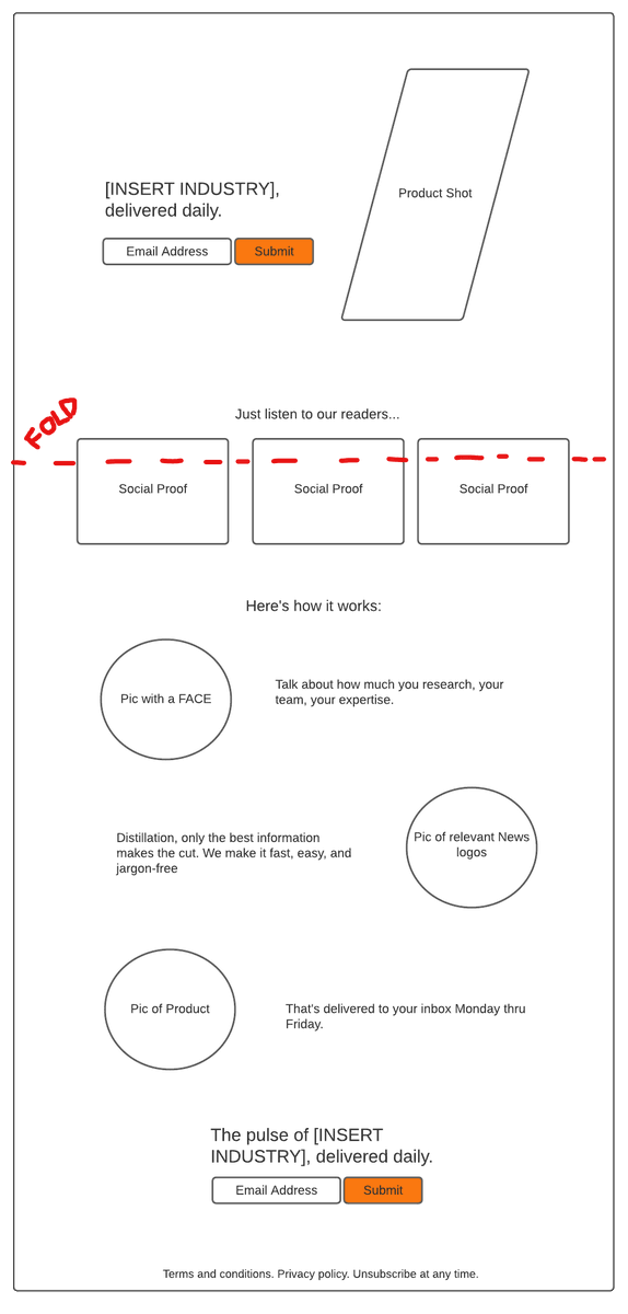
The must-have parts:
- The signup form
- The product shot
- Social-proof
- A/B testing capability.
That’s it. Don’t complicate it further.
Let's break down each part.
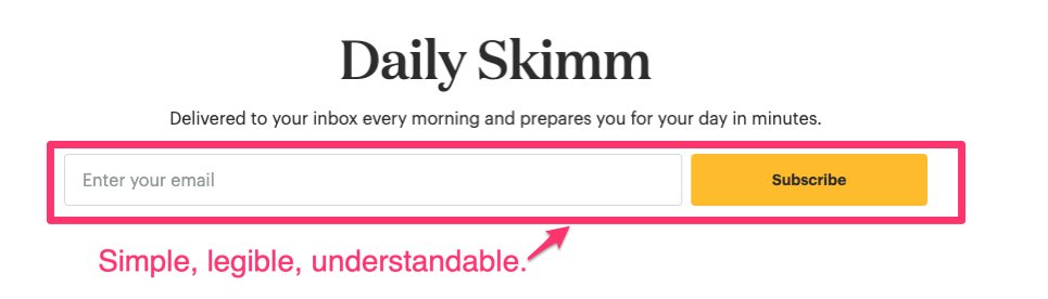
1. The signup form
This should be legible and take a standardized design.
Don't re-invent input boxes. Use something people are familiar with online. AKA Avoid "over-designing" this.
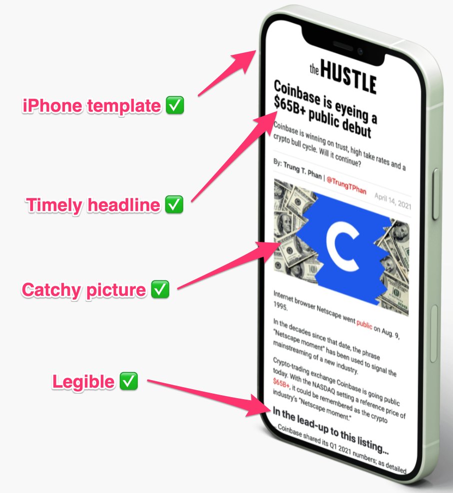
2. The product shot
Often, you'll see a product shot in an iPhone template.
You've got seconds to make an impression — nothing says 'credibility' like seeing the actual product.
Use an actual newsletter, have a picture (bonus:with a face), and a catchy, timely headline.
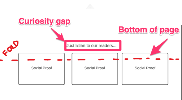
3. The Social Proof
This is all about credibility and playing up FOMO.
Try to pull snappy one-line testimonials. (Remember: SECONDS is all people will give you.)
Don't have any testimonials? Ask for them. It works.
Don't have an audience? That's another thread friend.
4. A/B testing capability
This is more of a "marketing stack" thing. AKA use tools that let you test.
All the findings in this thread are the result of testing.
My recommendation (and I hate myself for it), @clickfunnels
It's the easiest, fastest way — but ditch it quick.
Some other things to keep in mind:
– Place a little something above the page fold to encourage scrolling
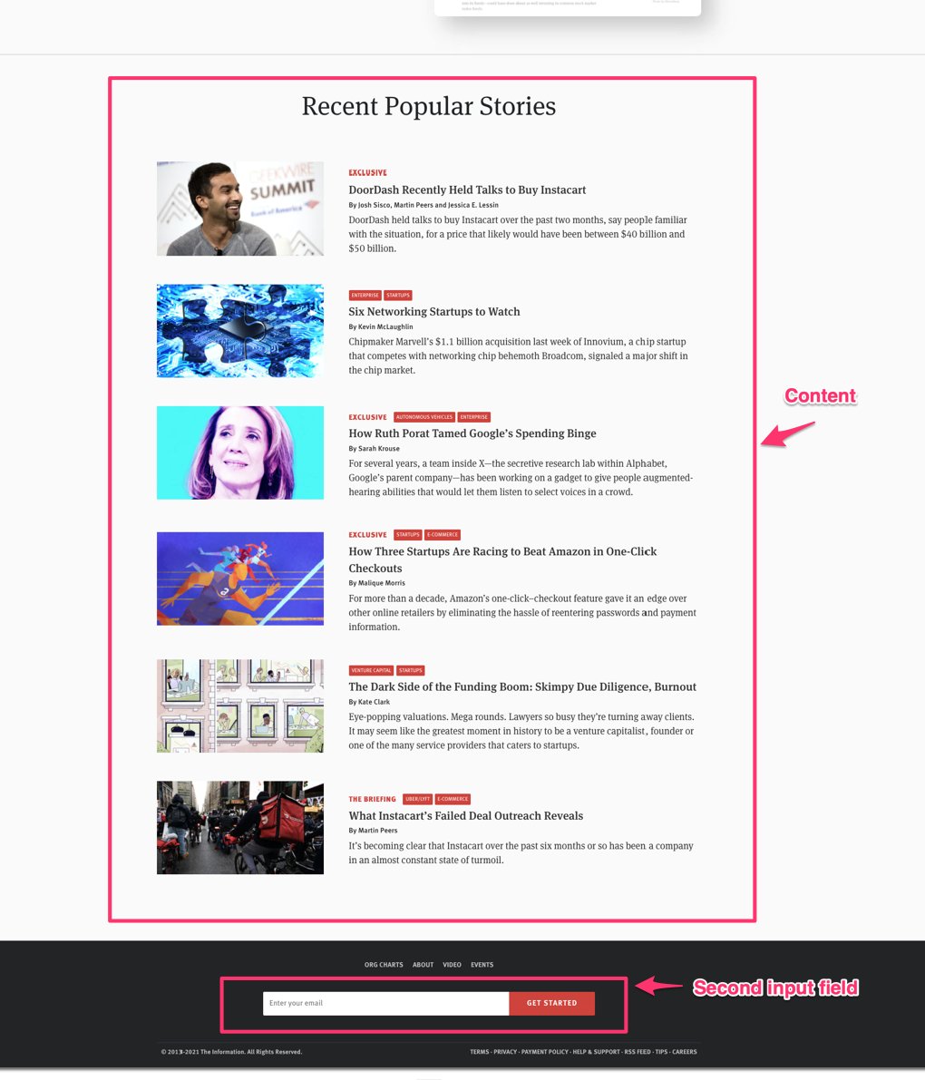
If you choose to add more content like a "how it works" section, add an input field OR anchor button at the bottom.
This is about removing any barrier however small. @theinformation does an okay job here. Could use a title above the field.
Last thing:
Make your signup landing page, your homepage.
Talking front page, root domain, "/"
If you're prioritizing signups, this is the best way to do it. You'll sacrifice certain web metrics, but emails are what you're after.
AND always forward to a thank you page.
Still working on the design of the newsletter? Join the club. It’s a never-ending process, but here are some shortcuts.